Wednesday, August 19, 2026

Google Finance UX/UI Fail


Google recently upgraded its Finance App to offer a better experience to users. The new desktop interface offers a more expansive layout than the previous look and now includes AI support. However, it fails miserably when considered from a UI/UX perspective. Let's take a look at a few of the problems in each of the three panels in the new format.

The Left Panel

In this left panel, a summary of portfolios displays along with every single item in a watchlist and a section entitled "Equity Sectors."

This panel cannot be resized, minimized, or otherwise closed. Why? Screen real estate is a valuable commodity.

Also, why only Equity Sectors?  Where are the equally important asset classes: Fixed Income, Commodities, Real Estate, Foreign Exchange, and Cash Equivalents? This one piece adds unnecessary noise to the view. It can be collapsed, but only temporarily.

The Center Panel


The default display shows announcements, major indices, the US Market Summary, latest news, dates for upcoming earnings reports, most active stocks, and daily gainers and losers.

Selecting items from a watchlist displays more detailed information about a particular stock in this panel.  Choosing a watchlist expands the left panel, overriding this center panel.  That works nicely.

Portfolio selection does not work the same.  Choosing a portfolio displays the contents of the portfolio and certain details in this center panel.  These detail columns can be customized to add more data to the view as well.  It should probably work the same as watchlist selection though.

When viewing a portfolio with more than 10 market items, it is impossible to view the associated data without continually scrolling back and forth and up and down, while struggling to remember the position of a specific item in a grid with no reference points. A side-to-side scroll bar is available at the bottom, but it is an empty and useless gesture for large portfolios.

The Right Panel

Welcome to the new "Research" Panel, or more accurately described as the introduction and intrusion of AI into your portfolio. 

This panel cannot be resized, minimized, or otherwise pushed out of sight.

The default view is a welcome message encouraging you to ask questions, of which a few random examples are provided. One can also ask it to perform analysis on what is visible in the middle panel or query markets in general. 

In Chrome, with Gemini already available, it is redundant at best.

Tasks can be executed from this panel too. In fact, Google now forces the user to use this panel for any updates to their portfolios. There is no other choice. If the intent is to use this platform to track an investment portfolio, one is stuck using AI.

It is a helpless and useless AI too.  

Most tasks associated with a watchlist are more easily performed from buttons already on screen.

Managing a portfolio using this Research Panel AI offers a new level of frustration. 

One can no longer simply add information to a portfolio as they did before. Google now forces the user to request that AI complete the task, taking the simplest process and pushing it down the path of unnecessary complexity.  What once only took a few keystrokes has been transformed into an argument over trade dates, pricing, and true transaction amounts. 

Who has time for this?

If I have to enter everything into a box, just give me all the fields required and segregated to do that.   At least give me a means of manually editing what Research Panel AI incorrectly positioned so I do not have spend an excessing amount of time arguing with it.

Beyond simple trades that it failed to execute properly, testing uncovered things the Research Panel refused to recognize that standard Gemini identified easily. In one instance, prior to Google pushing the major enhancement enabling users to sort by Ticker, the Research Panel was requested to take the columns from a portfolio presented in the center panel and redisplay the list with only the columns for Ticker and Total Gain/Loss, sorted in Ticker alphabetical order. The Research Panel insisted that the data did not exist. Gemini quickly displayed the requested information without argument.

Additionally, in the conversion to this new build, developers failed to ensure that data migrated correctly.  A lot of users report that daily tracking of their portfolio is lost forever.  Google simply dropped the transaction dates of many portfolio items.  As a consolation, the Research Panel AI recommends that you simply add those back for each and every stock.  It obviously is completely clueless as to the time that could take for large portfolios that have been in place for an extended period, with multiple transactions.

Thanks, Google.  Again, who has time for this?

Final Thoughts

I wish I could say I that I do not understand why Google refuses to enable manually entry as an option.

The answer is all too clear though.

They have spent a lot of money on this, and you will use it, you will like it, and you will work for free helping to train it up.

AI should be an additive tool for deep research or complex queries.  It should not be a mandatory gatekeeper for simple 2-second data entry forms.

Additionally, I will remain forever confused by those who continue to insist that Google is some sort of UI/UX expert.  They are anything but that, and this is one of many glaring examples.

Google did do one thing extremely valuable in this rebuild.  They helped me realize the usefulness of my personal brokerage platform.  Those guys spent serious time and money understanding UX.  The worst thing I encounter there is a login with two-factor authentication every time.

Friday, August 7, 2026

Empty Your Outlook Inbox


Another helpful tech tip for keeping the old Outlook inbox slim and trim, for those that may not know.

Are you using your mailbox as a To-Do List and have 4,563,231 emails and growing?

Stop it now and end your day with an empty inbox, or at least nearly empty.

I do.

All you have to do is flag your email and then archive it out of your sight.

It will still be searchable, and you can assign a due date to it, to remind you that it needs to be done.

What?

Yes.  Just flag them and get rid of them.

Here’s what you do …

In your inbox on each message, you should have the option to “Flag this message.”

It looks like a little flag and turns red when you click it.

Click that flag!

Now, click the little blue checkmark on the left toolbar.  

It says “To Do” when you hover over it.

In the left panel of the new screen, you will see “Flagged email.”

Click it!

When you get a lot of things in here, it will say “Earlier, Today, Tomorrow, A date range, Later, etc…”

Most importantly, you will say a section that says, “No Date.”

Expand it if you need to, using the little “ > “to the left of that title.

Hover over the Item Title and you will see a little “i” that is circled.

Click it!

A panel opens on the right the details of that item and usually shows only the subject of the email and a link to open it.

Here you can add a Due Date, a Reminder, Color Tags, Attachments and your own notes.

Follow this process and each time you flag an email, and you can just archive it out of sight or move it off to a folder.  Do NOT delete the email.  That will delete to To Do.  Archive is in your right-click menu and looks like a little file box.

Hope this helps make your inbox less frightening!  Good Luck!

Now, if only Google offered anything as reasonable integrated.

Thursday, July 16, 2026

Google Scrapes the Barrel

Image borrowed from Quartz

Today, the notification below arrived, and immediately thought to myself, "Wow, Google.  You are really scraping the barrel."


We are reaching out to notify you of an upcoming update to our storage policies, along with new controls designed to give you more control over your Android backups.

The Policy Update: Effective in 45 days, all data included in your Android device backups will begin counting toward your Google Account storage limit. Photos and videos in Google Photos and MMS data already count toward your Google Account storage today. With this change all other backed-up data such as SMS messages, call history, device settings, and app settings will also count toward your Google Account storage. The storage used by your device backup may increase once this policy takes effect. If your Google Account exceeds its storage limit, your automatic backups will pause until you free up space or upgrade your plan.

New Controls for You: With this change, we are also introducing granular app backup toggles in your Android backup settings. If you are on Android 9 or higher, you can now select exactly which data types and individual apps you want to back up, ensuring you only use storage for what matters most to you.

Your current storage status:

Your estimated increase in Android device backup will be 0.05 GB after this change. 


Is all this really necessary? I guess they have to somehow recoup all those billions they are throwing at their AI somehow.

When they actually begin to charge a fair price for cloud storage, perhaps I will change my mind.. Local storage is cheaper and folks should turn away from this nonsense.

Google is just a like a drug dealer.  They give you services for free for years, then about-face and start charging you.  They were not always that way.  The internet was not always this way.

Monday, July 13, 2026

A Hot Weekend in Arkansas


Heading south into Arkansas again, the weather was clear and extremely hot, with a level of humidity that left things a bit disgusting.  Rain was promised for the entire weekend.  We knew better though.  At this time of the year, it was just as much of a lie and guess as it is in Kansas City.


Crossing Bull Shoals Lake on the Ferry, temperatures hovered around 34°C.  There was not a breath of wind to be found for a little relief, even in the crossing itself, causing us to finally give in to air conditioning for the remainder of the trip.  Pausing in Yellville for an bit of art, we decided to pursue a coarse towards US-65 so that we might intercept sustenance at one of our favorite locations.


Saturday temperatures and humidity were not much different from the day before, encouraging the world to seek shelter indoors or in the lake. A morning hike at Mossy Bluff left me soaked enough that I decided I might as well be in the lake, and subsequently threw myself in as much.  A follow-up detour down to Cabot left everyone in Heber dealing with the promised rain in a fierce little storm we did not have the opportunity to make as much as a passing acquaintance with, beyond the backwash.

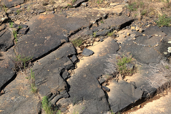
Gathering Affection on a Volcanic Flow by g.T.c on 500px.com

It did cool things down, making Sunday a bit more presentable, though only for a little while.  A relatively early jaunt down to wander the perimeter of Woolly Hollow Lake ended in disappointment.  Usually, that hike ends with a dip in the lake to cool things down.  Said water body lacked in the usual depth, showcasing bathtub temperatures, and weird green things floating in the unusually murky depths.  It stood in stark contrast with the previous day at Greers Ferry, where one could easily 2 meters down, and so that is where I returned to quench my thirst for floating about.


Satisfied with good company and good food, we turned our thoughts and vehicle homeward on Monday.  We diverted through the Bluffton Preserve on the Archey Fork on whim, as a previous visit to the location found it partially closed for hunting.  Suspecting that nobody was much interested in chasing beasts through the burning rainforest, we found it perfect for a little off road adventuring, puddle-jumping and rock-skipping.  


Very likely the most satisfying part of the journey turned out to be discovery that a local community had joined forces to take over the land and maintenance of South Mountain Scenic Overlook, thereby thwarting future commercial development next to our favorite little coffee shop and scenic overlook.

Tuesday, July 7, 2026

Tao Verse 18


"If you need rules to be kind and just ... virtue is absent."
 

Tuesday, June 30, 2026

CORI, my new App


Completely and accidentally, I named my own Power BI application today.  It started with me trying to give it a title that emphasized exactly what it is, a "Consolidated Organizational Reporting Interface."

It is a word salad of sorts, but after staring it for a moment, I realized it had a name.  "CORI."  Now it just needs representation.

I could have designed something but that would have taken weeks.  AI to the rescue.  Gemini failed and I was truly disappointed, after having considered it much more creative than my other alternative.

Copilot offered up the following results, which were much better than I anticipated. The header image on this post is what Gemini came up with, and could do no better with additional prompts.


Copilot response (above):  Generated.

When asked, "What if it looked like a person?"


Copilot Response (image above):  I generated a personified version of CORI as a professional reporting and analytics ambassador.

I prompted further, "Can you make it race neutral?"


Copilot Response (image above):  I've generated a more neutral, stylized corporate mascot version of CORI that avoids strongly emphasizing any specific demographic characteristics while keeping the professional analytics-focused branding.

I further prompted, "Is is possible to go more gender neutral?"


Copilot Response (image above):  Yes. A better approach for a corporate reporting platform mascot is often to move away from a human altogether and use a branded character.  I generated a version where CORI is represented as a neutral data-avatar/mascot built from the brand colors and analytics theme. This avoids drawing attention to gender, race, age, or other personal characteristics and tends to work better for organization-wide branding.

Thursday, June 11, 2026

A Return to Vegas


A return to Las Vegas found it much the same as I had left it two years ago on my first journey into Sin City.  The only remarkable difference proved to be the absence of grandstands for the Grand Prix and the temperature; the latter ensured those not eager to gamble stayed close to the pool only to venture out after the sun fell out of the sky.  October is undoubtedly a better time to visit than June.


For me, conference activities kept me busy through most of the daylight hours.  This engagement carried through to a little pool time in the early evening, before venturing out into the night.  It also prevented much wandering about out of a need to be fresh for more conference activities in the morning hours.  A lack of grandstands offered a better view of The Fountains of the Bellagio and I lingered about that area, primarily.


The hosts of the event offered a bit of sustained entertainment on the final evening there, though not outside of that quarter.  A brief walk through the casino and across the bridge spanning the strip setup an evening of good music, food and beverages under the desert sky.


Very likely, the most interesting part of the journey was as it always is; the view from just behind the wing, high above the earth.  This one activity continually offers the most intriguing sights to be witnessed anywhere and never looks the same twice.

Monday, June 8, 2026

Extortion at Kansas City International Airport


Prices at the airport border have gone from ridiculous to utterly absurd.  The above photograph is very real, taken at Kansas City International Airport on June 8, 2026.

Once passengers pass through TSA security, traditional market competition completely vanishes.  Why  do these stores feel the need to gouge consumers at this level; more so, why does the City, who very much manages these establishments, and in some cases owns them, permit this sort of highway robbery and extortion!

The next time one considers buying something this basic from those thieves, consider the following, offered by Google Gemini, when asked about the cost of producing a single Snickers bar:

While Mars Inc. keeps its exact proprietary cost sheets closely guarded, food industry cost models and manufacturing breakdowns give a very clear picture.

For a mega-manufacturer utilizing massive economies of scale, the total cost to manufacture, package, and ship a standard, regular-sized (1.86 oz / 52.7 g) Snickers bar is roughly 20 to 30 cents.

When you buy a Snickers at a convenience store checkout for $2.00, you aren't paying for the physical candy; you are paying for the massive supply chain, marketing, and retail markup that got it there.

Where Does the Rest of Your $2.00 Go?

If Mars manufactures it for roughly a quarter, the rest of the price tag is eaten up by the "food value chain." Mars sells the bar to a distributor or wholesaler, who sells it to a retailer. By the time it hits a grocery or gas station shelf, the retailer applies a healthy markup (often 40% to 50%) to cover their own rent, labor, and profit margins.   

What is that Markup in this Instance? 

The airport is hitting consumers with a staggering markup of over 2,000% over base production cost.

Do we also need to discuss how the City is also charging vendors astronomical rents, as well as taking a percentage of their sales?  

Isn't that the way "The Mafia" used to do it?

This is nothing but a racket.

Perhaps it is time for Kansas City to follow the lead of other major airports across the country (like Portland International or Minneapolis-St. Paul), who have enacted strict "Street Pricing" regulations. These rules legally mandate that airport concessionaires cannot charge more than 10% to 15% above what the same item costs at a standard brick-and-mortar location outside the airport. 

Wednesday, June 3, 2026

Copilot Notebook Enhancement Annoyance


Today, I discovered what a few others have begun to uncover. Microsoft has made yet another UI change to Copilot that has left users guessing.  Notebooks have mysteriously disappeared.  

When this feature first rolled out, I had no idea what to with it and turned to Copilot to explain it.

Recognizing the advantage of this feature, I rolled through a few projects using it and relying upon it as my place to compile all of my project notes.

They have yanked this feature apparently.  Though it still exists, just not where it is supposed to live, in the menu!

<rant> Do they not understand that nobody wants to play that game, hunting for what was previously right up front and is now nowhere to be found, except through discussion with their Artificial Imbecile. Google was slow to figure this out too.  Nobody wants to start using something only to have it yanked out from under them. It is not helpful.  It is not useful.  We will find something more reliable.  We will find a better way and without you.  That is all. </rant>

Monday, June 1, 2026

fabric vs snowflake

Why Ventra Health Chose Snowflake to Power Its Next Generation of Data and Analytics | by Kevin Crittendon | Snowflake Builders Blog: Data Engineers, App Developers, AI, & Data Science | Medium

Asked to take a look at the above article and offer some thoughts, here are few insights I have gathered from my own experience, other discussions and conferences.

This is an interesting case study highlighting Snowflake’s strength as a high-performance data warehouse, but I feel that the evaluation is limited to a lens that overlooks broader platform considerations.

For organizations heavily invested in the Microsoft stack and Power BI, Fabric represents a more strategic long-term platform due to its integrated architecture and reduced operational overhead.

Fabric is not intended to compete solely as a warehouse. It is designed to be an end-to-end data platform that minimizes data movement, reduces dependency on ETL pipelines, and eliminates duplication across systems.

The comparison largely measures how efficiently data is moved, where the value in Fabric lies in reducing or eliminating that movement altogether.

Findings also suggest a pipeline-heavy implementation (e.g., Data Factory-driven ETL), which reflects design choices rather than platform limitations. Fabric is optimized around OneLake and Direct Lake, enabling native access patterns that avoid replication and reduce latency.

The reported cost pressures align with a pipeline-centric architecture. In my opinion, Fabric offers a more predictable, capacity-based cost model when used as designed, with centralized storage, Direct Lake BI workloads, and minimal data movement.

Snowflake does simplify data warehousing and very efficiently, but introduces another level of complexity, and another point of failure.

Fabric simplifies the entire analytics ecosystem, using native integration with Power BI, Entra ID, and Microsoft 365, eliminating the need for additional tools, connectors, and duplicated semantic layers.

Fabric represents a different category altogether: a unified data and analytics platform designed to consolidate data engineering, warehousing, business intelligence, and governance into a single, integrated solution.

Sunday, May 17, 2026

Tao Verse 17


If one doesn't trust himself how can he trust anyone else?

Friday, May 1, 2026

Overtime Reallocation

Executive Summary

The Overtime Reallocation report helps executive leadership understand where overtime is occurring, how overtime hours are distributed across locations, and which employees, positions, and programs are driving overtime utilization. Unlike a traditional overtime report, the model reallocates regular and overtime hours by employee, week, and location to provide a more accurate representation of where overtime actually occurred. The report is owned by the COO, CPO, and CFO and is intended to support workforce planning, operational oversight, and labor cost management.

This effort was a little different than most, hence the "Reallocation" identifier in the title.

What does that mean?

Regular hours are allocated primary‑location first up to 40 hours/week, with any remaining regular time spread proportionally across secondary locations. Overtime (hours >40) stays at the location worked. This preserves where work actually occurred while ensuring consistent weekly rules and accurate cost allocation across locations.

Trend to Goal

The Trend to Goal page provides an executive view of staffing performance against authorized hours. This page is intended to quickly identify which homes are meeting authorized staffing targets and which require attention.

It highlights:

  • Actual % of Authorized Hours
  • Scheduled % of Authorized Hours
  • Current variance performance
  • Top-performing and bottom-performing homes
  • Performance trends over the last 13 months

Executive Summary

The Executive Summary page serves as the primary leadership dashboard and provides a high-level overview of overtime activity across Community Living operations. It is the report's primary monitoring and decision-support page. Key metrics and visualizations include:

  • Total Hours Worked
  • Total Regular Hours
  • Total Overtime Hours
  • Overtime Percentage
  • Overtime by Location
  • Overtime by Position Code
  • Overtime by Employee
  • Weekly Overtime Trend
This page is designed to answer executive questions such as:
  • How much overtime are we using?
  • Is overtime increasing or decreasing?
  • Which locations are generating the most overtime?
  • Which positions contribute the most overtime?
  • Which employees have the highest overtime utilization?

Location Detail

The Location Detail page analyzes overtime allocation at the location level and helps operational leadership identify locations that consistently generate overtime and understand how hours are being allocated within those locations.

Users can review:
  • Regular hours by location
  • Overtime hours by location
  • Overtime percentage by location
  • Primary versus secondary work location allocations
  • Location hours distribution trends

Employee Detail

The Employee Detail page provides employee-level overtime analysis and validation. The page is intended for auditing and explaining overtime distribution for individual employees and validating allocation calculations.

Users can review:
  • Employee work locations
  • Weekly allocated hours
  • Regular hours by location
  • Overtime hours by location
  • Total allocated hours
  • Employee overtime percentages

Version Notes

The Version Notes page contains the technical documentation for the report. The documentation emphasizes that row-level values are the authoritative source and that report grand totals should be interpreted carefully because Power BI does not recalculate allocation logic at higher aggregation levels.  It includes:
  • Overtime allocation methodology
  • Power Query calculations
  • DAX measures
  • Weekly classification rules
  • Primary and secondary location assignment logic
  • Data source assumptions
  • Report revision history
  • Known limitations regarding totals and aggregations
NOTE:  This is the very first report produced solely upon the support of Microsoft Copilot and proved quite a challenge keeping the AI on track and focused.  


Thursday, April 23, 2026

Assuming the Drab Color of the World


I needed a little something in case I got stuck with nothing to do on a recent trip.  Most simply turn their attention to that little black box in their pocket.  I usually avoid that at all costs.  This book stuck out on my bookshelf as something that might be mildly entertaining, without too huge of commitment.   I do not recall from where it came at all.  It just appeared in my collection one day; perhaps, under its own power, it invited itself into my world.  

Regardless.  While standing in the line of eternity at the airport, I began reading and quickly found it fit the bill perfectly.  Short passages within specific topic chapters outlined a diversity of opinion and speculation on the cause of this or that in the turn-of-the-century Ozark world.

One of the most striking observations came in the forward.  It not only fits the time of the writing but could easily be applied to the impact of globalization that occurred throughout much of the time after.

"Wherever railroads and highway penetrate, wherever newspapers and moves and radios are introduced, the people gradually lose their distinctive local traits and assume the drab color which characterizes conventional Americans elsewhere. The Ozarkers are changing rather rapidly just now, and it may be that a few more years of progress will find them thinking and acting very much like country folk in other parts of the United States. This standardizing transformation is still far from complete, however. A great body of folk belief dies very slowly, and I suspect that some vestiges of backwoods superstition will be with us for al long time to come."

Indeed these vestiges of backwoods superstition persist in much of our daily lives, as demonstrated by a few other passages within the book.  The very first that I encountered took me back to a saying my great-grandmother espoused frequently that was always left me a little confused about what rain and sunshine had to do with the devil beating his wife.  I remain perplexed to this day too.

The next I encountered came straight from my parents mouths.  It is but another that leaves me wondering.  Why Bread and Butter?


Some may be more familiar with the "Salt and Pepper" variation.  While this one seems equally unfounded, the book does discuss beliefs surrounding various aspects of good and evil associated with having, keeping and freely giving salt away to another.

Then there are some that do not match perfectly to well known phrases, though it is easy to tell from where they may have had their beginnings, as with this related to finding a pin.


I could probably snapshot most of this book, and may yet include more of these phrases in the comments as I go along.  It is a fun read, to the say the least.  Some phrases have no specific origin and some are meant to keep children busy in the days before radio, television, or any sort of other technology. I neglected to snapshot this point but it amounted to sending children to go count the freckles on the face of another to find out how many days until summer or some such thing.

Randolph, V. (2012). Ozark Magic and Folklore. Dover Publications. (Original work published 1947).

Tuesday, April 14, 2026

Monday, March 30, 2026

Mineral Baths to Mountain Bluffs

Our Anniversary Escape this year led us to Hot Springs in Arkansas.  The biggest motivator seemed to be that every other attempt to visit the namesake placename has ended in some disruption or another.  The most recent attempt north of Yellowstone in Montana found the place had closed for the season the weekend just prior to our arrival.  This turned out very similar to other attempts too, though not a complete failure.

It is an interesting little town to explore and soak in a little, quite literally and of course, figuratively. While three days felt like the perfect amount of time to get a good taste of the area, a longer stay would be needed, if one were to have an interest in conquering things like the 21 km Sunset Trail.


Hiking was not at the top of this agenda this time, though we did afford time for the Gulpha Gorge Trail, after pausing for a ride up to the top of the Mountain Tower for a look around the valley.  Most of the remainder of the time involved parading up and down Central Avenue, relaxing in a mineral bath and enjoying some delicious German food.

Local art proved itself an unexpected highlight, featuring an array of massive murals climbing three or four stories high. These pops of fresh paint felt like a modern dialogue against the city's historic backdrop, appearing in almost every corner of the downtown area.


Leaving the city behind, the second half of the adventure turned north into the Flatside Wilderness of the Ouachita National Forest.  The detour was mostly unplanned, beyond knowing of a waterfall there that just happened to be along the way.  We found the cascade mostly dry, though an interesting space in the middle of nowhere to visit.  The trek in and out of the location, crawling up and the rough roads offered their own adventure, proving once again that the journey is just as important as the destination.


Returning to our home away from home in Heber Springs offered time to enjoy friends and family and scoot up to Batesville Motor Speedway for the annual dusting at .  It was a bit cooler than last year, and the wind was not quite as tuned into the direction it should have, but not awful.  The drone of engines and a good coating of red clay just feels right on a cool spring night.


A day on my own led me to the North Sylamore Creek Trail.  Road conditions deterred previous transports from enjoying this piece of scenery.  The short route down to the Allison Trailhead is not always in the best of conditions.  This time, well-prepared with a high clearance vehicle, the road presented itself in much more appropriate fashion.


With transport parked firmly in place, a secondary obstacle loomed.  The creek itself it not much where the trail first meets the bank. However, the Forest Service encourages a trek north from there about 100 yards and cross at a much deeper section.  It is undoubtedly one of those little counterintuitive trail quirks.  Perhaps during high water, it is a shorter distance but then again, much deeper still.


Once on the trail, the landscape changes as the trail climbs steadily to meander northerly above the river, enabling spectacular views of where water likely spills over the edge of the bluff high above, in several locations; that is, in damper conditions.  The stretch defines Ozark geology, with hidden caves and weathered karst littering the length of the journey.


After exploring roughly 4 of the 30 kilometers associated with this trail, it was time to think about heading back since I had no clue how long it was really going to take and there were other plans for the evening hours.  Emerging from the wilderness earlier than expected offered time for a quick jaunt over South Sylmore Creek and its swinging bridge.


The road back to Heber Springs from Mountain View takes about as much time as crossing from one side of Kansas City to other.  It is undeniably more interesting though, even if the state continues to push to straighten out the roads and remove the deep valley dives.


Conversation and a good meal brought things to a close for the day, so much so that we completely  lost track of time.  We realized too late that we missed the change to jump over to Sandy Beach to enjoy the sun set on another enjoyable journey into Arkansas.  There is always another chance.


The drive homeward did not really stand out all that much.  Anticipated afternoon storms, coupled with a return to work looming on the morning horizon the next day encouraged arrival at an earlier than normal time.   It had  been another good journey, leaving us with good memories, multiple new additions to The Ozarks collection, and a little red clay all around.

Saturday, March 21, 2026

KC 2 Atlanta & Back

Downtown Atlanta proved an interesting place to explore for a few days, while attending FABCON / SQLCON 2026.  More compelling than anything else, I had the opportunity to capture a few views for the collection from 9 km or so in the air.

Basecamp held its own unique history, though not much is left of the old place beyond a high-rise with a spectacular view from the outdoor pool on the 19th floor.  With a Margaritaville attached, a Waffle House a block away,  Centennial Park sprawling across the street, and the Georgia World Conference Center lie just on the other side  of that, it proved itself the perfect location.

In my spare time, I wandered about a 2 km radius from the location, taking in the local art and dropping by the state capitol building.  The space between has definitely seen better times, though appeared as though it were rebuilding to return to those glory days. It was an interesting town, and very walkable in the daylight, though I am not sure I would return with the sole intent on seeing Atlanta.

Monday, March 16, 2026

Wednesday, February 25, 2026

Mason Jars, Dishware, and Mowers in the Forest

Hiking about one of my favorite spots this past weekend, I got to thinking about a previous discovery there, and thought to check in on it.  I almost forgot where it was.  I checked one spot and then another, before a crunching sound underfoot that did not align to the sound of leaves confirmed the location.  

Brushing away the dead leaves, I noticed some of the pieces of mason jars previously noted.  There were not quite as many as before and the rusting remnants of the vehicle that contained these artifacts were nowhere to be found.  That is not surprising.  At the time, I had made the mistake of posting about this little discovery on Twitter. Shame on me.  Lesson Learned.   

A couple of new pieces emerge this time, with a few more light brushes.  They were only lightly covered in soil and appeared to be part of some sort of dishware.  Turning the piece over, fading paint appeared on the artifact.  It was not much thicker than a nickel and appeared to be hand-painted.  An AI search on this image indicates:

"The image displays a shard of antique porcelain with significant crazing, which are the fine cracks in the glazed surface and a common sign of age in old ceramics.  The pattern appears to be a transferware design, potentially from the 19th or early 20th century."

The second piece was a bit larger and probably a flanged bowl of some sort.  Judging by the diameter and the convex interior curve, it might have been a old wash basin.  An AI search on this image indicates:

The object in the image appears to be a shard of vintage ceramic dishware, likely stoneware, featuring a cream-colored glaze. The shard shows a thick body typical of 19th or early 20th-century pottery, with significant crazing (fine cracks) in the glaze.

Coloring, texture, and general make indicate both items are related, beyond just their location. They were rescued and cleaned under hot water and placed in a plastic bag for preservation.  I feel as though I may need to excavate a bit more of this situation to learn more. 

This is the most anyone will get to know this time.

The backstory on this weird little archaeological find begins after a series of heavy rains a couple of years ago, when I discovered an interesting artifact along the trail of one of my favorite hiking spots.  Lying perpendicular to the trail in a ditch created by downhill drainage, I noticed a chunk of metal sticking up and went to examine.  Brushing away leaves and dirt uncovered what appeared to be the decaying bed of an old pickup type vehicle from the 1930s.  The tailgate remained mostly intact, though sides and bed were one. Multiple broken mason jars lay against a corner of where one of the remaining corners met the tailgate.

It appeared that someone had been driving along and had broken down while ascending the hill.  The general direction of the vehicle indicated progress from the direction of Liberty towards Gladstone. They apparently just left everything there, though that seems a bit odd for someone to do.  Did they go looking for help or otherwise and simply forgot how to get back?  Did they just give entirely?  Did they get caught transporting moonshine?  Did they die here?  What exactly happened?  Scant research uncovered nothing.

Leaving this little find in place and undisturbed, I took a couple of photos and unwittingly made a post about the discovery on Twitter.  Returning to the site a few months later, it should have been no surprise to discover that someone had been rooting around, though it remained mostly undisturbed.

I posted on Twitter about it, at the time. I should have never done that and won't make the same mistake twice.  Almost everything described in this back story has vanished.

A few hundred yards from there, an old mower lay quiet on the forest floor.  This land was used for something at one time, or it was junk yard.  Hard to tell just now.  More research is needed.  Below are a few shots of that in the last couple of months.


Monday, February 2, 2026

Wednesday, January 28, 2026

SharePoint List Deprecation in favor of Rules


Microsoft continues to align with the Google way of doing business, abandoning processes that are user-friendly in favor of a more awkward way of doing things.  It is simply continuing technical stupidity.

Microsoft strives to deliver utmost value to our customers through modern, optimized, secure solutions in this newly evolved world focused on digital transformation. As part of this evolution of Microsoft 365 solutions, we will be retiring SharePoint Alerts and believe Microsoft 365 customers will be better served by modern notification solutions based upon the Power Automate platform or SharePoint Rules. - SharePoint Alerts retirement - Microsoft Support

Microsoft, you believe wrongly.  Alerts were simple and straightforward.  We now have to setup 3 rules to accomplish what one alert did perfectly.  Additionally, the Rule does not include information that the Alert included, which causes users to have to click-through to get to that information.  To get that information, you have to create an Automation.  I can get through it, but it is not exactly a simple process for nearly all of my user community.  This is not helpful.  Thanks for piling on more work for me, Microsoft.

I suppose that I should be thankful they are not ditching SharePoint completely.


Popular Variations